Did you know 99% of email users check their inboxes daily?
All your prospects are using email. And if you can land well-designed emails in their inboxes, conversions are inevitable.
But that’s where most people mess up. They send low-quality emails only to find spam boxes—not new leads.
This guide will teach you how to create quality emails primed for lead generation.
You’ll learn:
- What email design is
- Why it’s important
- And proven tactics to give your brand the best impression possible
We also share examples to inspire your design.
What is email design?
Email design is the science of creating emails that engage your target audience. In B2B, this means turning prospects into leads and customers.
The importance of email design
Emails shape your prospects’ impression of your brand. If you design them poorly, people will report your messages as spam and move on.
But well-designed emails convert total strangers into loyal customers. Customers can instantly tell the sender is a serious contact who values their time.
Email design best practices
Email is the single most effective channel of B2B outreach when used right.
But good emails don’t happen by accident. Conveying your message effectively requires a strategic approach.
Below, we’ve shared tried-and-true design practices guaranteed to boost your success rates.
Craft attention-grabbing subject lines
33% of people open emails just based on their subject lines.
It’s the first thing your recipients see, in bold font. They look like this:

Email subject lines should earn readers’ attention—not expect it. Here’s how:
- Offer value, enticing people to open
- Don’t use clickbait—be honest with your intentions
- Talk like a human being (not too formally)
- Use as few words as possible
It’s about summarizing the email in a single sentence without being boring. For example:
- “The answer to [pain point]”
- “[Lead’s company] could profit from working with [your company]
- “[Lead’s competitor] struggled with sales. Then we increased inbound by 47%.”
Subject lines promising value tangible value are practically guaranteed to get opened.
Make your pre-headers count
An email’s pre-header is the text shown after the subject line. It acts as a preview of the email’s content.
Pre-headers are the most underrated part of email design. They’re the bridge between reading the subject line and opening the email.

If the subject line interests someone, they’ll read the pre-header. And if that excites them, they’ll open the email.
Here’s how to make pre-headers count:
- Build excitement with enticing text
- Strengthen the subject line, don’t repeat it
- Keep it under 50 characters
- Personalize it without being cheesy
Combined with strong subject lines, great pre-headers make emails irresistible.
Keep It Brief
The average professional gets countless emails each day.
If they open your email and see long-winded paragraphs, they’ll immediately close it and move on. Most people won’t even try to figure out what’s in your email if they can’t skim it.
So instead of writing blog posts, get to the damn point. Tell your readers:
- Who you are
- What you want
- Why they should care
The sweet spot for email length is between 50-125 words. Any longer, and readers will start to tune out.
Be personable (without sounding desperate or fake)
Personalization is crucial for making your emails stand out. Sadly, many think using someone’s name and gushing empty praise counts as personalization.
But it doesn’t—fake personalization only makes things worse.

According to B2B outreach pro-Jessica La, effective personalization is about specificity and tone:
“When you’re specific, you show true care towards strangers—something scarce in the digital world. By bringing up details of an article someone wrote or a comment they made on a post, you show attention to detail.”
But specifics alone won’t stop you from sounding desperate, she warns. “You want to be subtly confident. Here are two examples:
- ‘I loved the article you wrote about conversational AI. Specifically, on how conversations build rapport and trust—you’re spot on with the retail store assistants.’
- ‘I loved that piece you wrote about conversational AI! Conversations really build rapport and trust. It’s so true about the retail store assistants!’
Same content, but vastly different tones. Can you sense the difference?”
Stay brand-friendly
Your emails should always reflect your broader brand identity. This means:
- Using the same fonts and colors as anywhere else (website, marketing materials, etc.)
- Keeping the same voice used throughout your other content
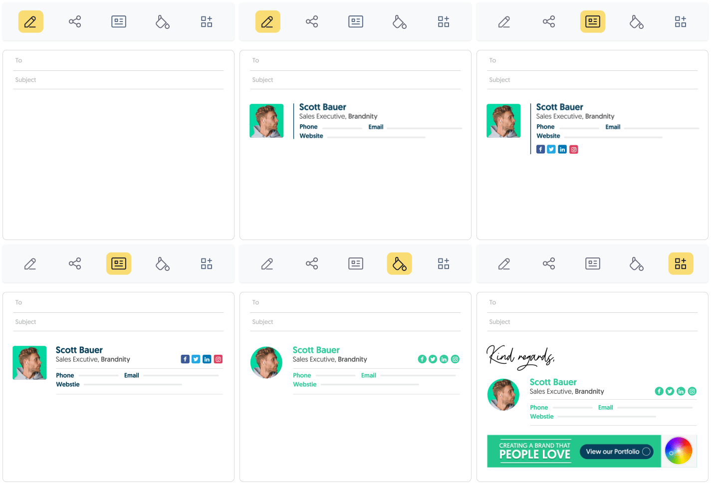
- Using an email signature featuring your name, logo, and a call-to-action (CTA).
A quick word on email signatures: most of them are boring. Use a signature creator if you’re serious about branding your emails professionally.
Use visual content
People process images up to 600x faster than text. Adding visuals is the easiest way to make your email stand out.
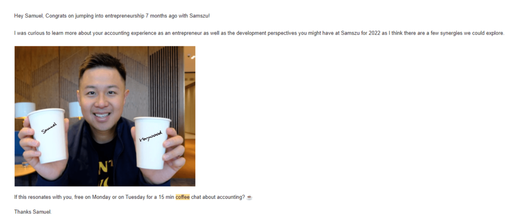
In the example below, someone added the recipient’s name to a coffee cup in a cold email.
Combining personalization and imagery created an eye-catching email. Even if the recipient isn’t interested in their pitch, they’ll still reply to share a chuckle.
Just make sure to keep images under one megabyte. Otherwise, they’ll take too long to load for many of your readers.
Use impactful header design
Email header design isn’t an exact science—it’s decided by your brand’s style. While some companies prefer fancy graphics, others like a more barebones, personal look.
No matter your style, follow these guidelines for the best performance:
- Add a “view in browser” option. Your graphics might not load correctly in all email clients. Linking to a browser version solves this problem
- Add your company logo. If nothing else, put your logo in your header. It’s the most recognizable part of your brand identity
- Place a promo banner across the top. If your brand’s running a deal, featuring it in your header will get tons of eyes on it
Don’t forget the footer
Many marketers slack on email footer design, thinking nobody scrolls that far down. But that’s a huge mistake—footers are great places for:
- Unsubscribe buttons
- Social proof
- Legal info
- Contact details
- Mission statements
- Blog links
- Social links
- And more
For worker emails (rather than a marketing address), include a signature in the footer. These can feature headshots, social links, promotions, and more.
And thanks to email signature design tools, they’re easier than ever to create.
Format properly
Nobody wants to read giant blocks of text. They overwhelm the reader and make your text impossible to read (no matter how great it is).
Make your emails skim-friendly. Avoid long sentences, use 2-3 sentence paragraphs, and keep vocab at a middle school level.
Proper formatting makes your emails easily digestible. This leads to much higher response rates versus cluttered text.
Use email-friendly fonts
There’s a temptation to use stylish web fonts to stand out in your prospects’ inboxes. But if they fail to load properly in someone’s email, your message is lost.
So instead of risking it, stick to these fonts:
- Helvetica
- Arial
- Verdana
- Georgia
- Trebuchet
- Tahoma
- Lucida
- Times New Roman
If you need to use custom fonts for brand purposes, make sure it falls back to one of the above choices.
Don’t use emojis
Emojis can ruin emails, despite popular belief.
In a recent Nielson study, participants responded to email subject lines with emojis and without them. The result: emoji emails received far more negative responses than non-emoji emails.
In their own study, Search Engine Journal found that non-emoji emails had a higher open rate. So while some email marketers insist on emojis, the science says otherwise.
Use a call to action (CTA)
CTAs provide your customers with direction. Without them, your email lacks direction and purpose.
Here’s how to create compelling CTAs for your email designs:
- Have one near the top of your email
- Make them big enough to be visible
- Use a color that contrasts against the background
- Have specific language (don’t just say “learn more”)
- Give ownership (“Start my download” over “start your download”)
- Use a button design
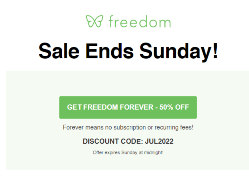
Freedom’s promotion email embodies these principles:
Its CTA is:
- Near the top
- Large enough for visibility
- Contrasts against the background
- In button form
- Specific
Most importantly, it provides clear value to the reader.
Crucial: add an unsubscribe button
Ideally, your emails always go to people interested in your products. But since you’re not a mind-reader, you’re bound to contact people who aren’t interested.
In those cases, adding an unsubscribe button makes a big difference. Instead of marking your email as spam, they can click a one-touch button to opt-out.
This protects your domain’s reputation and gives your brand a good first impression. Who knows, maybe they’ll contact you in the future?
Unsubscribe buttons also keep you in compliance with CAN-SPAM laws. If readers can’t opt out of emails easily, the FTC could fine your company.
Important: use an email signature
Our research shows emails with professional signatures get 32%+ more replies.
Email signatures make you much more personable to recipients. By giving the full context of your identity, people feel like they’re talking to a real person rather than a text block.
Here’s what makes a great email signature:
- Professional headshot
- Full name
- Company name
- Job title
- Contact details
- Social links (LinkedIn, Twitter, etc.)
- Disclaimers
Email signature generators make it easy to design a signature with everything you need.

A/B Test your emails to find effective designs
A/B testing (AKA “split testing”) involves sending two versions of an email at the same time to see which design works best. It takes all the guesswork out of email design, allowing you to make tweaks based on hard data.
Testable email design components
Testing many changes at once makes it impossible to know which tweaks affect the results. Instead, try out different changes one at a time.
Start with these parts:
- Subject line
- From name
- Pre-header
- Email copy
- Visuals
- Email Signature
- CTA
- Length
- Personalization
- Delivery times
With enough testing, you can create a B2B email design earning phenomenal results.
Best email design examples and ideas
To help you craft compelling emails, we’ve collected some of the best examples from the business world.
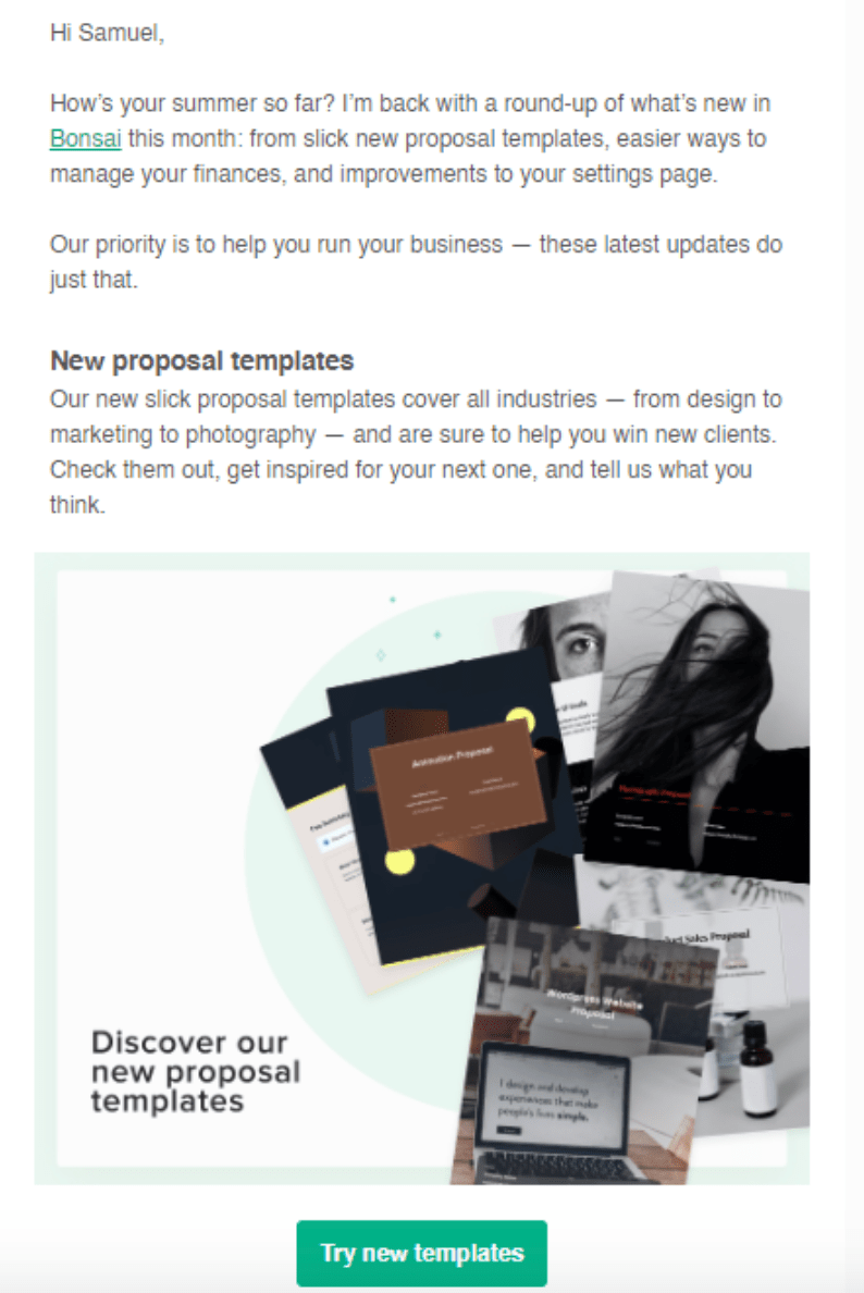
Bonsai product update
Bonsai’s product update email appears directly to its target market’s needs. Starting with a personalized greeting, Bonsai gets right to the point.
Its minimalist design features sleek graphics, enticing the reader to learn more. Readers get pure value and no
promotional fluff.
Jasper.ai newsletter design
Rather than update their users with a no-reply address, Jasper’s marketing lead addresses them personally. Their email reads like a real person talking to a friend.
Austin’s text is straightforward, providing readers with pure value without wasting words. And for those who don’t want to hear from him anymore, he offers a one-touch opt-out.
And at the end, he features a fully-functional email signature. It lists his name, position, location, socials, and more.
Wordtune social profile promotion
Wordtune sent this message to get clients to follow them on social media. This email design is great because:
- It features a quality graphic tailored to the message
- It’s brief—the entire message is less than 50 characters
- The formatting allows plenty of whitespace for mobile-friendly viewing
- It’s intuitive—it links directly to their socials, so people don’t have to find them
While long-form content has its place, short-form is more effective for busy readers.
Add an email signature for an instant boost
Effective email design is at the core of outreach success.
Every day, your audience’s inboxes overflow with dozens of emails. Only top-quality email designs will stand out from the crowd.
This guide explained many ways to make your emails more effective. But if you want to make a truly professional impression, there’s no alternative to a good email signature.
Luckily, WiseStamp makes it easy for anyone to have a top-quality signature. Try our generator for free now, and make signature drive responses, leads, and sales.


