Branded signature for business – what it is & how it’s done
What is branded signature? Learn how to create a branded signature, see guidelines for email signature branding, and get inspiration from real brand signature examples.

Short answer
How to do email signature branding?
- Include the essential branded signature information: Employee name, title, and email address, and company name, logo, website, social media links, and CTA
- Make your signature visually pleasing: I) Use your brand colors II) Structure your signature hierarchically III) Use a high-quality image IV) Use white space V) Remove clutter
- Ensure email signature consistency throughout the entire organization
- Technically validate your signature: I) Mobile-friendliness II) Email-safe fonts III) Broken links IV) Valid images
This article covers email signature branding guidelines, paired with real-life branded email signature examples. Read on to get the hang of email signature branding, and start doing it for your company right away.
We wrote this guide with branding managers, marketing managers, and business owners in mind, but it can benefit personal branding as well.
Click to create the perfect branded email signature

What is a branded signature?
A branded email signature is an email signature that’s consistent with your company’s branding guidelines. A branded signature should include your brand logo, use your brand colors, and strive to tell your brand story. To have a positive impact on your business, a brand signature should be added to all employee emails.
What is email signature branding?
Email signature branding is the art of using branded email signatures to build brand awareness. Signature branding campaigns can be pointed inside your organization to reinforce brand identification or pointed outside to make your brand more recognizable. Signature branding is done by using Email Signature Management software to centrally control all company email signatures and give them a consistent unified design.
Why is a branded email signature important?
Email signature branding is important because it makes your brand, and by extension, your company more memorable. It makes people perceive you as more professional, and it keeps your company top of mind. Repeated email signature impressions help people remember you, and understand what you stand for. This will ultimately make them trust you more.
Email signature branding guidelines & examples
Email signature branding guidelines are a subset of email signature design principles. We cover the principles for email signature design elsewhere, so this section will focus on those aspects specifically relevant for signature branding.

Branded signature example (our very own)
1. Include the essential elements of a professional company email signature
What a branded signature includes:
- Employee name
- Employee title
- Company name
- Company logo
- Company website address
- Employee email address
- Social media icons (linking to company social media pages)
- CTA
Other elements can be added, such as a personal photo, brick and mortar address, work hours, a disclaimer, a green footer, etc. But these additional elements are non-essential for most online businesses.
2. Make your signature visually pleasing
A professional brand email signature is first and foremost visually pleasing. That “beauty is in the eye of the beholder” is broadly accepted. But despite that, designers have known for quite a while that beauty can be achieved universally by following basic design rules.
I) Use your brand colors
Using your brand colors is the natural choice for your brand signature. Brand colors are those that appear in your brand logo. Over time these colors are associated with the brand. Think of Coca-Cola, what colors come up?
Use 1 or 2 colors (or shades) from your logo and no more
Too many colors in one email signature will make it look like a circus (which makes you a clown). If you don’t know the exact Hex or RGB color codes for your brand colors, you can use this color picker tool to upload your logo and fish them out.
Most companies only have 1 or 2 colors in their logo, so having to select 1 or 2 may not even be a problem for you. But If you have more than that, like Google, for example, limit yourself accordingly.
Use colors sparingly
Use them for separator lines, backgrounds, or social icons.
Limit the use of color in text
Only use colors for your name and job title. Some colors may be too light and have low contrast against the white email background. Stick to dark and high contrast color shades, or better yet, use black letters, which usually look most professional.
II) Use information hierarchy
Information hierarchy is a fancy word for describing the way information is organized and presented. There are clear rules for email signature information architecture.
Information organization:
The most important information should be at the top of your signature. The less important stuff should be at the bottom.
Information presentation:
The most important text should be in large letters. You can give text added visual prominence by using bolding, text color, or background color.
Most brand signatures follow a similar information structure and presentation.
Most brand signatures follow a similar information structure and presentation:
The employee’s name is in large bolded letters. The job title and company name are slightly smaller (same size but not in bold). The rest of the signature text is smaller still, with the information labels, like Phone, Email, etc set in bold.
We end up with 4 levels of hierarchy, achieved by 2 distinct text sizes and 2 and by using bolding.
See the example for good use of font size and bolding:
Employee Name |
| Website: www.example.com Email: name@example.com Mobile: 585-815-7074 Address: 840 Hill Drive, Buffalo, NY 14224 |
It’s highly advised to use just 2 font sizes and use color or bolding to create your size hierarchy.
III) Use a high-quality image
Low-quality images take away from your perceived professionalism as a company and as an individual. A low-quality image implies that you have limited access to resources. It also implies that you invested little time and effort in your brand signature.
The way you carry yourself reflects your ability and credibility. So a low-quality signature reflects a low-quality brand. This opinion is formed in most people’s minds in under a second. Yet it’s so so sticky. Do what you can to avoid leaving this impression.
You should be able to discern that your signature image is high quality just by eye-balling it. If you’re not sure – ask your graphic designer or other co-workers. As a rule of thumb, if your image looks pixelated or fuzzy around the edges then it’s low quality.
Take a look and the example below and see if you can spot the difference:

Good example

Bad example
IV) Use white space
White space is a basic principle of design. Visual elements rely on the white space between them to be clearly discerned, understood, and appreciated. White space is also called negative space, and it’s not necessarily white.
Take a look at the 2 examples below, which do you find more visually appealing?
Most people will prefer the one with white space. If you use WiseStamp to create your brand signature, the tool will take care of this issue for you. You’ll also have a few options to increase or decrease the signature white space, to make your signature more spacious or more compact.

Branded signature the uses white space

Branded signature without white space
V) Remove clutter
Clutter can be defined as any and all elements within your brand signature that are not strictly required.
That old truism, “less is more”, is especially true for small but complex creatures like an email signature. Any additional element included in your signature must contribute to your business goals. Otherwise, it will compete over the reader’s attention with those elements that do contribute.
- You may not need to add an email address if you are already communicating by email.
- You may not need a brick-and-mortar address or office hours if you’re strictly an online business.
- You may not need 3 different CTAs for HR, Sales, and Marketing. Instead, you can assign a signature to each department with its own email signature campaign.
- You may not need the employee’s image. Your brand logo can have all the attention for itself.
Click to create the perfect branded email signature

2. Tell a story
Every brand should have its own uniquely valuable story. If your brand does not have one then this is a deeper problem than making a great branded signature. Your brand’s story tells people the qualities you represent and the values you stand for. Your story is what sets you apart. It’s what makes you stand out.
For example, Apple’s story is one of going with your truth against the current, and persevering through creativity, impeccable performance, and beautiful design. The brand’s story is bound to the story of its co-founder Steve Jobs.
Apple’s slogan “Think different” embodies the brand’s story and invites Apple’s customers to be part of it – to see themselves as creative, and bold.
Whatever your story is, you can hint at it with as little as 2 words. In the context of your branded signature, you have different means at your disposal to tell your story and stand out.
I) Add subtle animation
A little motion can go a long way in telling your brand story. You can create an email signature animation that encompasses the essence of your story. If you put the time to think it through, you can say a lot with very little – like Apple’s 2-word slogan “Think different”.
Animation is also a good way to bring attention to your brand signature. But, in the context of “textual information blocks” like an email signature, the use of animation is something that should not be overdone.
The motion should be enough to get people’s attention but not too much so it holds it indefinitely. An animation that’s too fast, or has too many moving parts, will make it hard to focus on the signature text (which is your ultimate goal). It will also drive people nuts.
This is a good example of using animation:

In this branded signature example, vcita animated its logo to express inclusivity, friendliness, and an invitation to join. The company’s brand story is about guiding you through the digital path so you can get back to being human.
vcita is a company that provides small businesses with all the digital tools they need to run their business efficiently. During Covid, vcita helped many thousands of US businesses go through their digital transformation.
vcita helps business owners automate and streamline the technical aspects of running a business. With that out of the way, business owners are free to spend more time doing what they love. With their newfound time and tools, they can connect with their customers on a deeper human level.
II) Add a video
Adding a video thumbnail to your brand email signature will let you tell your story in full. A video is highly engaging and if you get people to click the thumbnail, they are likely to view your video to the end.
A video can tell your brand story from many different angles:
- A demo of your product
- A talk about your website redesign
- A video about your awesome (real) company culture
- A popular webinar you’ve made
- A new product launch
- And many more
You don’t have to commit to one video forever. You can change the video to fit your seasonal campaign. Like your Christmas campaign, Halloween, Black Friday, or any other sale.
Whatever you do, only use video materials that your target audience will connect with. Too many brand videos I’ve seen do a horrible job at telling a compelling story. Many videos just chew and spit out generic messaging by “enthusiastic” employees, or worse still fake faces with fake smiles. An ingenuine story is no story at all.
Fiverr even made fun of this trend to position themselves as a counter corporate, young and nonconformist company (which I assume to be their brand story).
Video: Fiverr satirical recruitment video

III) Add an image gallery
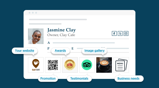
An image gallery can be used in many different ways to paint a picture of what you do, the values you represent, or the experience you offer. We’ve seen a lot of our users use our image gallery app to tell a story.
- We see companies use credentials or certification badges to tell a story that readers can trust in the company’s expertise.
- We see companies use images of happy clients with a quote about a positive experience
- We see eCommerce companies showcasing their best selling products with links to discounts
- We see and we see companies listing their partnerships with known brands
Video: How companies use an image gallery in their email signature to tell their brand story:
(for the examples jump to 3:12)
IV) Add a quote – personal brand
Adding a quote to your brand signature is only a good idea if you’re using it for your personal brand. Companies have slogans, they don’t use quotes by others.
But if you, as a professional, identify deeply with a certain famous quote, adding such a quote can help you tell your personal brand story. Just keep in mind that quotes are charged with cultural meaning, so make sure your quote is understood the way you intend it to.
3) Ensure email signature consistency throughout the entire organization
People give email content high attention. Email signature branding makes use of this high attention in order to build brand awareness. By showing consistent branding in all company email signatures, you build brand recognition over time.
But why is this important?
In a survey done by Lucidpress, 68% of businesses reported that brand consistency has contributed 10-20% to their growth in revenue or more. We know from our own user surveys that branded company email signatures can increase email link clicks by up to 22%, and email leads by up to 15%. With these statistics in mind, unifying your email signature across your entire company should be a priority for you.
Brand awareness email signature campaigns
In the previous section, we’ve covered email signature branding best practices. Once you apply those guidelines you are practically running a brand awareness campaign with every email your company sends.
If you already have an email signature brand awareness campaign in mind, you may like to try out the WiseStamp Signature Manager, to quickly and easily set it up.

WiseStamp Signature Manager – Branded signature views
If this is the first time you’ve heard of brand awareness email signature campaigns, then read on to find more about it.
2 main types of branding campaigns:
- External – strengthens your brand presence in your niche
- Internal – strengthens the degree to which your employees self-identify with your brand
I) External branding campaigns
Most email signature branding efforts are pointed outwards. Becoming a recognized brand is the holy grail for most marketers. Recognized brands are more likely to be recommended even by people that have no experience with that brand. Recognized industry brands are carried far and wide on the wings of fame. This effect is called the Recognition heuristic, but getting there is very hard.
Email signature branding is one of the most effective ways to build brand recognition. It capitulates on the personal relationship prospects have with your employees. Their personal relationship with a person is extended to their relationship with your brand.
II) Internal branding campaigns
The goal of internal branding campaigns is to create an emotional connection to your brand. Strong emotional identification with your brand is highly valuable. It strengthens employees’ commitment to advancing business goals and helps the business retain valuable team members.
Most modern jobs involve intensive daily use of email. Having your brand logo in your workers’ email signature will make sure they constantly see it. This makes it an important touch-point to include in your internal branding campaign.
This is especially powerful for businesses with a large number of employees working out of the office. These employees typically have weak brand identification, having spent most of their work hours on their own.
4) Technically validate your signature
It may not seem that way but an email signature is complicated to get right. Its complicatedness comes from the versatility a signature is required to have for it to show perfectly on every email client. The signature code may be simple, but it has to be tested and validated against all email clients, browsers, and screen sizes.
I) Mobile-friendliness
For your email signature to be mobile friendly it needs to be built in responsive HTML. This just means that the signature layout knows to automatically adapt to the screen size in which it is presented. A signature that is not built this way will break, or distort.
But creating responsive code is not enough. Not all branded signature designs will look good on mobile, even if they don’t break. To create a truly mobile-friendly signature you should design your brand signature for mobile presentation, to begin with.
In more practical terms this means creating a signature that is less than 350px in width (the low end of mobile device screen size). A good mobile-friendly signature uses a stacked design – with each item of information occupying a separate row.

Left – mobile-friendly branded signature | Right – broken, partially hidden non-mobile-friendly brand signature
II) Email-safe fonts
You’d be surprised how restricted fonts are in emails. Most email providers, including the major ones, like Outlook, Gmail, Apple Mail, and Yahoo, will only show a limited number of fonts.
To make things worse, even the limited few fonts each email provider offers are different for each provider. In the end, you are left with those few fonts that work on all emails. These are email-safe fonts.
This means that your special brand font or the fancy font you bought for your website will not be supported. An unsupported font will not be seen by your recipients.
An unsupported font may also break your signature. The reason it may break is that different fonts have different letter sizes and different spaces between letters.
When a font is not supported the email client will swap it for their default font. This font may well be different in letter size and space. If this happens the signature text will expand or contract, causing your signature to break. To make sure your signature always looks the way you designed it, use email-safe fonts.
Email-safe fonts:
- Arial
- Times New Roman
- Tahoma
- Georgia
- Lucida Sans Unicode
- Courier New
- Trebuchet MS
- Verdana
Read more about the best fonts for email signatures >>
III) Broken links
Broken links are everywhere on the internet and they find their way into emails all the time. I regularly find broken links in our GetWiser newsletter, which is sent out to about 2 million subscribers each month (luckily I find them before it’s sent out). Links get broken because of little typo mistakes or a copy-paste that was done hastily, and sometimes a page’s URL is changed or the page is deleted.
Clicking on a broken link can be very frustrating for your email readers and can create a bad unprofessional impression. The negative impact this can have is huge when deploying a branded company signature for hundreds or thousands of employees. So, it’s important to do what you can to avoid this.
What to do:
- Verify each link before deploying your email signature.
- Verify your links periodically once a week or once every 2 weeks, to make sure no URL was changed and no page was deleted.
IV) Valid images
This is usually not a problem. But just in case you can make sure your images are showing in your signature 100% of the time by following the guidelines below.
Avoid using very large images
Avoid using PDFs as image format
Avoid image size HTML styling that exceeds mobile device screen sizes (350px to be on the safe side)
V) Signature character limit
Email providers have a set character limit for an email signature of around 9000 characters. This limit is large enough to accommodate any text signature you’d fancy making (most emails don’t come close to that many characters).
But this limit becomes more troublesome when you want to use customized HTML email signatures. See, the character count also applies to the HTML. And this means that the styling, links, and advanced features you add to your signatures, like a video thumbnail or a button, all add up.
When this happens the email client will not present your email signature, and instead, give an error notice (“Email signature too long”). WiseStamp validates your signatures against these character limits to save you the inconvenience.
Character limit for Outlook and Gmail signatures:
- Gmail – 10,000 (10kb)
- Outlook – 8096 (8kb)
How do I create a branded email signature?
In case you still don’t have a company signature, let’s see a few ways you can create one for your company.
If you’ve read this article to this point then you already have a pretty good idea of the benefits you can extract from a branded signature. If you take this thought one step further you’ll see why failing to create a branded signature will set you back compared to those of your competitors that do brand their signatures.
There are a few ways to go about creating your branded email signature:
- Create it manually
- Use an email signature manager
- Use free email signature generator
I) Create your signature manually
The process of creating a signature manually requires employing a graphic designer to make your signature design and having a developer code the signature in HTML.
Pros:
- This approach is that you can make any customization as you’d like
Cons:
- Costly to do by outsourcing
- Requires going through the entire process each time you want to update your signature
- Requires employees to manually set up and update the signature in their own email.
- Does not solve the problem of having to deploy the signature (and updates) in every single employee email. This will have to be done
II) Use an email signature manager
Email signature management software is the most cost-effective way for creating your branded signature. Signature managers always come with a signature generator that makes designing your signature quick and easy.
But signature managers’ main contribution is their ability to integrate with business email platforms like G Suite and Office 365. This allows centralized deployment of your branded signature to all employee emails with a few clicks.
WiseStamp is consistently voted easiest email signature manager to use in G2 and Capterra. It’s also considered to be the most secure signature manager since it does not route your email traffic through a 3rd party server, like all other managers. Rather it only makes changes to your signature block. WiseStamp is also the most customizable in terms of signature design and features. You can learn more about WiseStamp here.
Pros:
- Fairly easy to create a signature using the tools signature generator
- Centralized control of all company email signatures
- Quick deployment of any little update made to the signature
- Email segmentation by department
- Cheaper than manually creating your signature
- Dedicated customer support
Cons:
- Some limitations in the signature design
- Some signature managers inject the signature into your company emails by routing your email traffic through their own servers. This makes them the defacto owner of your data and makes you reliant on their cyber security measures

III) Use a free email signature generator
There are quite a few free email signature generators available. These tools make it very easy to create an email signature. 99% of them provide more or less the same result. Some are more limited than others. Our own free email signature generator has the most extensive capabilities in the market, feel free to give it a try.
The main reason we don’t advise using a free signature genrator to create your branded signature is that they do not solve the problem of deploying your signature on all your emails.
In the end, your biggest obstacle is having to get every last one of your employees to install their signature on their own. This can be a nightmare for companies. The more employees, the bigger the nightmare problem.
Pros:
- Fairly easy to create your email signature
- Free to use any time you need it
Cons:
- Limited in features and design
- Little to no customer support
- Does not provide centralized email signature management


