Home / Email signature examples / Cool email signatures
21 cool email signature designs you can use as your own
Learn how to design a creative email signature by stealing our users’ best ideas
Create and set up a professional email signature:

What makes a good email signature? It’s an email signature that gives viewers something beyond the bare essential information. Most people don’t realize that you can use your email signature design to tell a story.
Most email signatures are pretty dull, they don’t tell a story and so they leave hardly any impression.
I can teach you how to use creative email signature design to give insight into who you are, your values, your skills, and your work.
This post will show you (and break down) some cool email signatures based on real signatures made by WiseStamp users. Feel free to use any of our email signature designs as your own. Feel free to steal and improve any of the creative email signature ideas we highlight here, to make your signature as amazing as it can be.
You can also go ahead and play around with these features, templates, and designs using our email signature designer. Use it to create the coolest professional signature in under 5 minutes.
For some useful tips and the email signature design examples, we promised (with full explanations) – keep reading.
What’s on this page
What makes a nice email signature?
A nice email signature gives viewers something to remember you by that’s beyond the essential information. This is achieved by adding visuals or audio elements that present a deeper story than plain text.
A nice signature is also visually pleasing and easy to read. This is achieved by creating a clear hierarchy, using white space, and limiting yourself to 2-3 colors or shades (preferably ones that correspond with your brand colors).
Basic elements for a creative email signature:
- Your full name
- Your job title
- Your direct phone number
- Your website URL
- Social media icons or buttons
Elements that enable a creative email signature:
- A signature banner
- An image gallery
- an animated GIF
- A video thumbnail
- A quote
- A “leave a review” link
- A ‘Let’s meetup’ Zoom button (for Sales)
- An Instagram gallery (for artists and designers)
- A ‘Please consider your environment’ green footer (to show you care)
- A SoundCloud track (for musicians)
Email signature design examples
1) Make enticing sales offers directly from your signature block
In this elegant design, Emily has highlighted property listings that she wants to promote. This is a great way to encourage her readers to click directly through to the website and read more about them. And it also makes for a nice-looking email signature.
All the info a prospect needs to be interested in a property is presented in her signature block, so it’s super easy for anyone to contact her and express interest.

Signature design with detailed sales offer
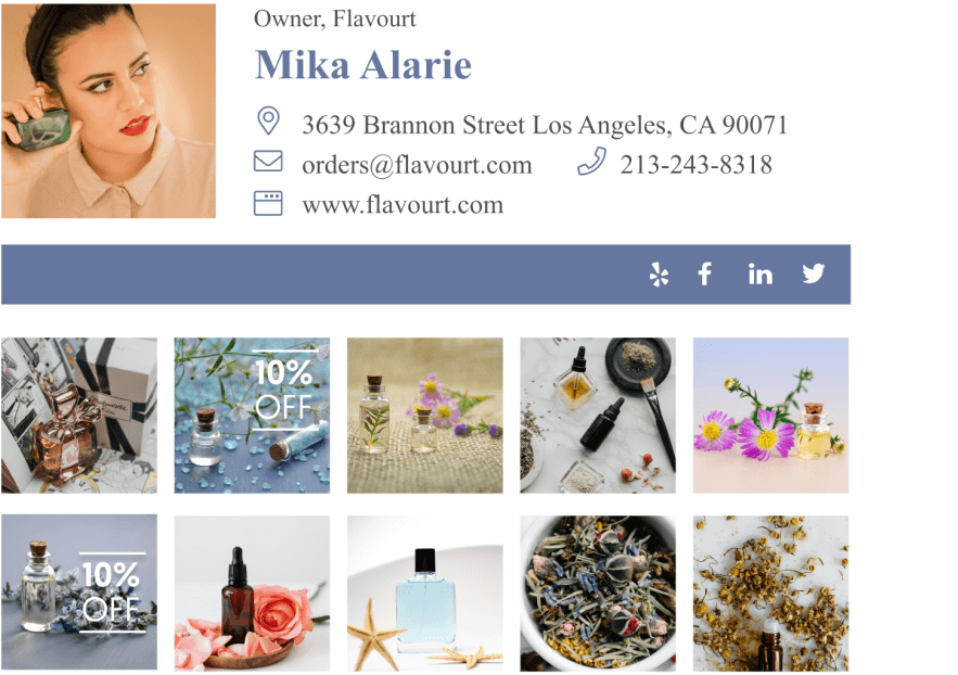
Below you can see another signature design example by Linda. She took a different approach to achieve the same business goal as Emily tries to achieve, but instead of using an email signature banner, Linda used WiseStamp’s email signature image gallery app to add images and links to her real estate listings.
It provides less info than Emily’s signature, but it gains added space to advertise more properties. As the old cliche goes, images speak louder than words (is that the saying? 🤔), meaning she can do without the info.
All she really needs to do is get her readers interested enough to click on the image link by using gorgeous images. When they visit her website she can go to work on convincing them to buy the property and giving them the info they’re missing.

Email signature design that encourages further exploration into sales offers
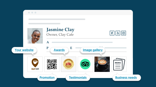
Some of the coolest things we see WiseStamp users do to rig their signature with enticing offers is through hyperlinked images. Images can be highly pleasing visually so it makes them a perfect tool for creating a call to action. Take a look at some of the creative ways people use our signature image gallery app to promote their business.
Video: Cool ways people use hyperlinked signature images to promote their business:
(for the examples jump to 3:12)
2) Make your signature come alive with animation
Animation is the most powerful technique to add story depth to your email signature’s limited space. Motion visuals embed a lot of information in them that still images do not.
By using animation creatively in your signature design you can show off your best wares, make yourself relatable and approachable, and even represent your basic values. Below are some real-life examples you can take inspiration from.
I. Show what you do, don’t tell
As a restaurant owner, Hiromi shows used a GIF to present his food instead of a static image. This cool and creative feature makes the food come alive and encourages viewers to book a table.
By including a prominent CTA button Hiromi makes it too easy to succumb to impulse and book a table on the spot.
Also, notice that the CTA and his name are both the same color as the logo to ensure that the whole signature stays on brand.
To save space and reduce text, his email signature makes excellent use of modern icons to represent the location, phone number, email, and website details.

The signature’s creative GIF makes the food come alive
II. Stand out with a Harry-Potter-like moving image
In this stand-up comedian signature example, Grace used an animated live image of herself to make her signature stand out. Her genuine smiling face makes her instantly more relatable, and at the same time tells the story of what she does.

III. use motion to express your brand values
In this branded email signature example, vcita animated its logo to express inclusivity, friendliness, and an invitation to join.
vcita is a company that provides small businesses with all the digital tools they need to run their business efficiently, so they can get back to doing the things they love. And that’s the story they try to express with their animation.

III. Hook people on your sales offer with eye-catching animation
A fancy way to pull in business through your email signature is by adding a banner to your email signature block.
But an even cooler idea to encourage clicks is by making that banner an eye-catching GIF (We have a huge gallery of pre-made GIFs like the one in the example that you can use in your Wisestamp signature).

Cool eye-catching sales banner
3) Show your work and talent with creative signature design
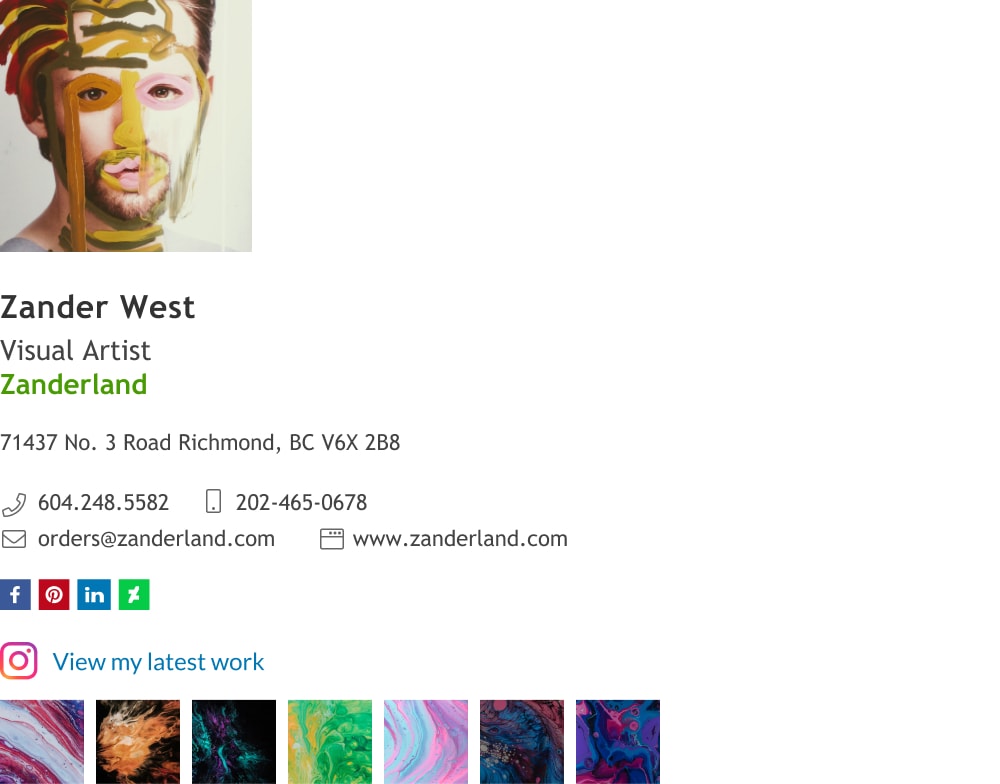
Zander did 2 cool tricks in his signature presentation that make him stand out as a visual designer.
I. Use your email signature visuals to showcase your artistry
Zander uses his signature image to present both himself and his creative artistry. He did an excellent job of leveraging the most noticeable element in the email signature block to bring added benefit, in a beautifully subtle way.
Creative use the email signature image
BTW, adding a strip of your published work from Instagram is as simple as adding our Instagram gallery add-on.
II. Link your email signature to your portfolio
The second cool hack Zander used is adding a gallery of his Instagram work at the bottom of his signature block with a link to his Instagram page. Link your email signature to your portfolio
This will pull people in – to view more and engage with his content, and also make them much more likely to make a purchase.
4) Add a personal touch with a cool handwritten sign-off
In this very nice (but conservative) signature, Steve used the Wisestamp signature handwritten sign-offs add-on to write “Kind regards” above his email signature
Note: this sign off can be changed to “Cheers” for a more casual tone, or simply your name for a personal tone. This is a cool design feature that leaves a personal impression. You can change it to what’s right for a specific recipient.
The fact that his sign-off looks like a handwritten signature gives the readers the feeling that he personally signed this email and gave them extra attention. The feeling of familiarity brought about by the handwritten signoff could increase the number of leads he gets from his email signature.

5) Make your email signature timely
You can use the handwritten signature app to sign off a timely message and further personalize your signature. One example is writing a holiday greeting (which you can pair with a holiday sales banner). But other options can be “Have a great weekend”, or simply signing your name.

6) Get creative with your signature CTA button
The concept of show don’t tell is used with the best results in email signature marketing. A lot of organizations use WiseStamp to manage their email signatures cross-company. Many of them apply this concept to their company email signature – especially to their Sales team signature segment
I. Visually guide users to take the desired action
We ourselves use a GIF banner to make our Sales Managers’ email signatures to ease prospects into the process of signing up for a demo.
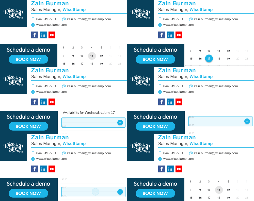
This Property Manager’s email signature example by Ruth follows the same concept but guides prospect to make a call rather than schedule a demo.

II. Make it easy for readers to take the desired actino
As a real estate agent, Chris relies on his realtor’s email signature for leads. So, he added 2 cool ways for prospects to easily contact him. He chose the Zoom button signature design available in Wisestamp’s generator to encourage readers to book a video call.
He also gives the extra option of setting up a meeting in person, just below the first CTA because (despite Covid-19) Zoom hasn’t quite dominated the entire world of meetings just yet.

Cool way to encourage a meeting directly from your email signature

III. Sometimes a simple button is the best design
Elise is a recruiter, and so she builds on her presence and personality to build trust with potential job candidates. She does not want motion or too many options to distract her readers from the simple act of applying for the job.
She depends on the persuasion of the content of her email to onboard her recipient, and she only needs a button to seal the deal. For this, a simple button will do.

7) Extend and enrich your branding
One of the coolest email signature ideas I’ve seen is using the signature logo component to add additional information, like your brand slogan, a discount offer, or advertising a coming event.
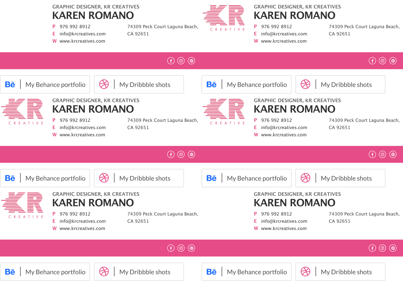
Karen used her brand’s animated logo to showcase a few of her design capabilities within her email signature in a clean and subtle way.
This extra feature could turn the proverbial heads and give her readers a taste of the kind of email signature design they could give themselves. It also serves to show that with a bit of design anyone can have a beautiful signature and look professional, like a big established organization.
8) Use a video to give depth to your email signature
Including the video thumbnail and a direct link to her YouTube video is a cool way to expose your readers to content and capabilities that you could never convey from a tiny signature footer.

What Christine did here is even better than just adding a video. What’s cool about her signature is that she made the video thumbnail into a nice GIF that already pulls the viewer into what the video has to offer. All her readers need to do is click the thumbnail GIF banner to complete what they “started”.

9) Allow your readers to hear
In this example, Josh has given his reader the ability to play one of his Youtube tracks right in the email. He also gave them access to his page on SoundCloud, Apple Music, and Spotify as social icons above his video thumbnail.
If you’re a starting musician this feature will maximize your ability to expose your new music through your daily emails. You never know who’s reading, or better yet listening. Maybe your next big breakthrough will come from there.
10) Make a big personal impression with our social media buttons template
In this example, Eunice has chosen to include her personal social accounts as well as corporate ones. By including links to her personal Facebook and Twitter accounts she reminds readers of her emails that they are dealing with an individual and not a faceless corporation.

She could have been content with the little social media icons, but she chose to give her social media a greater presence by using big outstanding buttons. She got way more clicks and more visits to her Twitter and Facebook pages because of that – a small change with an amazing impact.
11) Show your dedication to protecting the environment
Add a green footer to discourage printing. We offer a selection of options for text which ranges from the short and direct ‘Don’t print this, ok?’ through to the gentler encouragement shown above.
Adding a green footer is a creative way of putting your values in the front. For many readers knowing that you represent values more than just business incentives is important for them to feel secure doing business with you.


Email signature design best practices
Now that we’ve seen some email signature designs in practice I’d like to let you in on the theory behind email signature design. If you’re in, then let’s take a look at some advanced concepts that go into designing an email signature. To make things clear and easy to grasp, I sprinkled in signature examples in order to show you each concept in practice.
Ready?
1) Use visual hierarchy to organize your info
Playing with size and color is a good way to create a sense of hierarchy. Just use this rule of thumb – make what’s important bigger and give it contrast against the less important elements.
Using line dividers or background colors is a useful way to emphasize your information hierarchy even more.
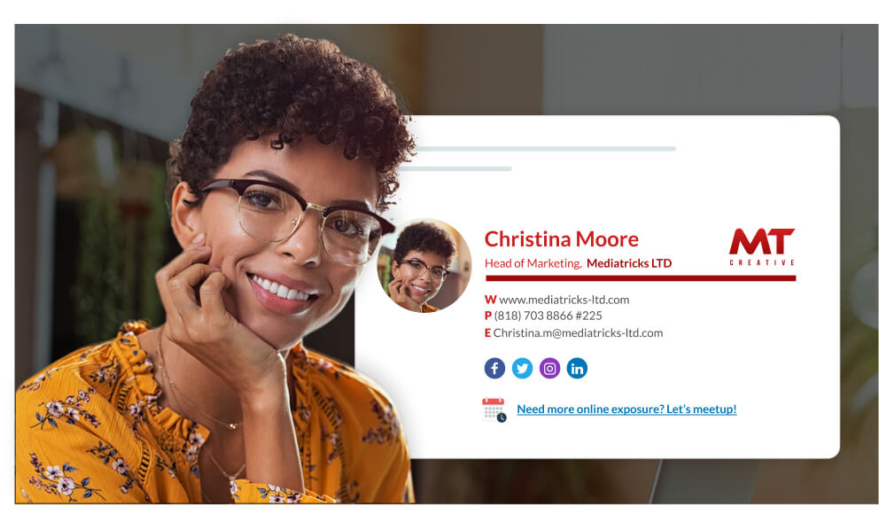
In the example above you can see Christina used a large font size for her name (undoubtedly the most important text in her signature) then gradually reduced the text size, going from her job title to her contact details.
To increase contrast, she gave her name a deeper red color than her job title. She increased contrast further against her contact info by putting it in grey. To top it off she used a line divider to separate her professional info from her contact info.
2) Make your signature simple and clean by using white space
White space is a good way to complement your visual hierarchy. It also gives people a sense of simplicity, order, and calm (yep, calm). Less content surrounded by more white space can go a long way in actually attracting eyeballs, whereas compressing lots of info into a small space will scare them off.
Eyes linger on simple but high-contrast visuals. Use this fact to increase how memorable your name and your logo will be to your correspondents and also associate some of that sense of order and calm with you and your brand.
”Less is more” and all that…
3) Stick to a simple email signature design
It’s easy to go overboard with creative design, and I can relate to the need for your signature to make a splash, but it’s way easier for design to go horribly wrong than to reach a beautiful and balanced outcome. But, there is a simple solution, just stick to your brand styles.
You’ve got branding?
Design consistently with your brand:
Use shades of your logo colors limitedly and use solid colors (like black and grey) for your contact details. If your branding has text then use the same font it uses in your signature (unless it’s hard to read)

Branded email signature design example
Still don’t have branding?
Stick to 2 colors and 1 classic font:
2 colors, and no more, will keep your signature from looking like a carnival stand. For a typical email signature, using 1 classic font like Helvetica, Domine or Quattrocento will be most appropriate and will also give you a professional look and keep your details perfectly readable (unlike over-the-top cursive or stylized fonts).
Good example

The Turquoise used for the labels and separator line was taken from the brand logo, and complements it.
Bad example

The Purple used for the letter labels and separator line does not match the brand logo colors.
If you’re in a more artistic profession, this may be too official and less suited to you. In which case you may want to check out our dedicated pages that cover situations that require a different approach:
Conclusion
It’s a well-known fact that beauty holds attention but it’s less known (though just as true) that beauty can also encourage compliance and make people more forgiving of minor infractions.
The bottom line is that you can actually get higher compliance from your prospects with beautiful email signature design.
Time to design your signature (takes 2 minutes)
Your email signature is a marketing opportunity you can’t afford to ignore (learn how email signature marketing is done in practice). The only people who see it are those interested enough in what you do to read your emails in full. They are perhaps your most important audience.
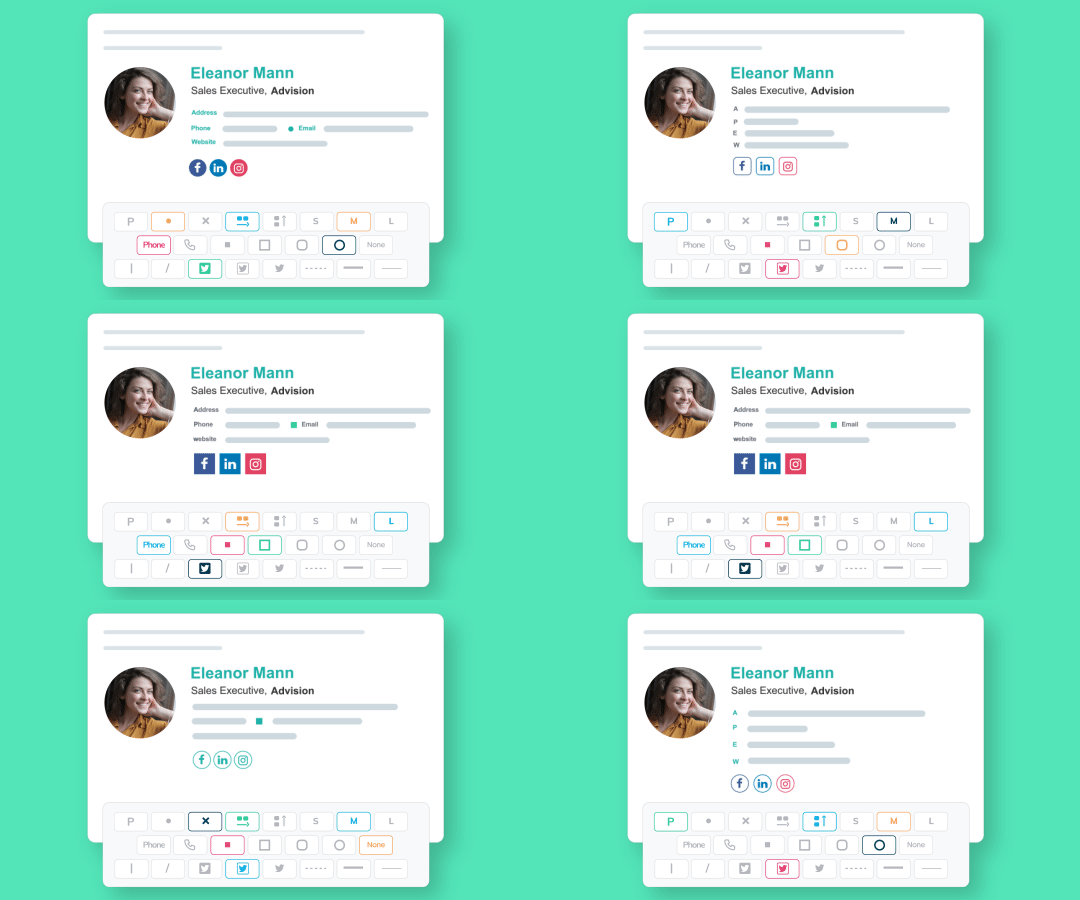
If you still don’t have a respectable email signature you can take this opportunity to create a free signature with our email signature designer. It’s the easiest way you can imagine to get a stylish email signature. It comes with fine signature designs, templates, and cool useful addons that will help you boost engagement, look professional and tell your readers what action to take next.
WiseStamp is used by over a million people all over the world from a whole range of industries. Don’t miss out.

- Cool email signatures design
- Minimalist email signature design
- Simple email signature design
- Clickable link email signatures
- Disclaimer email signatures
- Email signature quotes
- Green signature footers
- Banner email signatures
- Social media icons email signatures
- Link Instagram to signature
- Add Linkedin to email signature
- Animated GIF signatures
- CTA email signatures
- Link Google Maps to signature
- Email sign off examples
- Video email signatures
- Personal email signature
Free email signature generator
Popular features:
- 1-Click setup in your email
- Designed template options
- Add-ons for every need
- Cool email signatures design
- Minimalist email signature design
- Simple email signature design
- Clickable link email signatures
- Disclaimer email signatures
- Email signature quotes
- Green signature footers
- Banner email signatures
- Social media icons email signatures
- Link Instagram to signature
- Add Linkedin to email signature
- Animated GIF signatures
- CTA email signatures
- Link Google Maps to signature
- Email sign off examples
- Video email signatures
- Personal email signature


